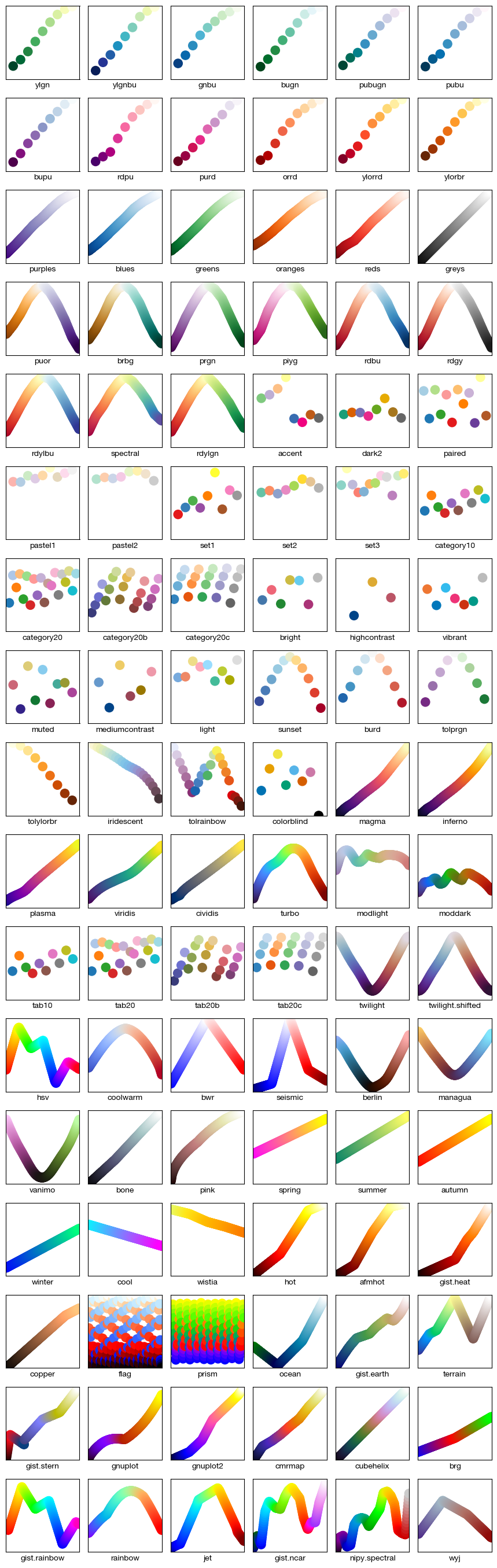
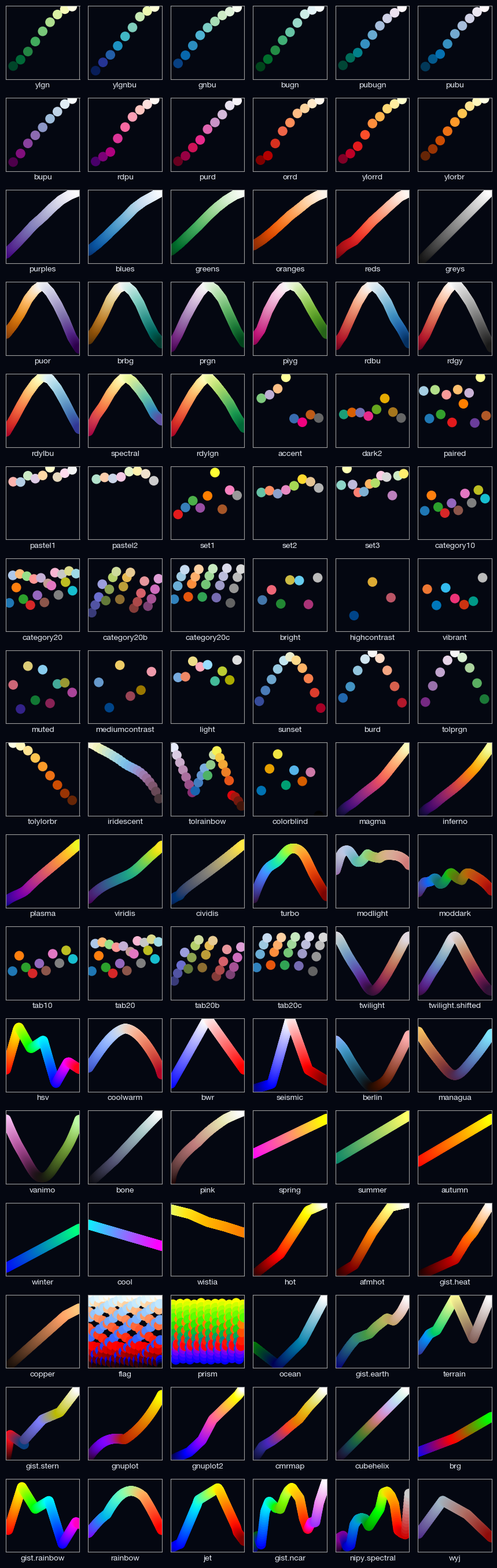
Appendix A. Reference Palettes#
For many applications, perceptually uniform colormaps are the best choice; that is, colormaps in which equal steps in data are perceived as equal steps in color space. The human brain perceives changes in lightness better than changes in hue, for example. Therefore, colormaps with monotonically increasing lightness are better understood by viewers.
Colormaps are typically categorized by their function:
Sequential colormaps: Lightness and saturation change gradually, usually using a single hue; suitable for data with ordered information.
Diverging colormaps: Lightness and saturation change for two different colors, meeting at an unsaturated color in the middle; suitable when the data has a critical midpoint, such as topographic maps or data deviating around zero.
Cyclic colormaps: Lightness varies for two different colors, meeting in the middle and unsaturated at both ends; suitable for values that cycle at the endpoints, such as phase angles, wind direction, or time of day.
Qualitative (discrete) colormaps: Used for unordered categorical variables and unordered paired variables. Ordered categorical variables use sequential colormaps.
Some miscellaneous colormaps have specific purposes for which they were created. For example,
gist.earth, ocean, and terrain all seem designed for plotting terrain (green/brown) and
water depth (blue). Therefore, we might expect divergence in these colormaps, but they have multiple
inflections of unrelated colors, making them less friendly for other uses. cmrmap is designed to
convert to uniform grayscale, though it seems to have minor inflections at the beginning. cubehelix
is designed for smooth variation in both lightness and hue, but appears to have a small hump in the
green hue region. turbo [1] is an improved version of jet, used for displaying differences
in depth and density.
Color Vision Deficiency#
A common task in data visualization is representing data with color scales or continuous colormaps,
typically in the form of heatmaps or choropleth maps. Several color scales are specifically designed
with color vision deficiency in mind and are widely used in academia, including cividis,
viridis, and parula. These scales combine a light-to-dark scale with a yellow-to-blue scale,
making them monotonically increasing and perceptually uniform for all forms of color vision. In
general, colormaps with monotonically increasing lightness are insensitive to various forms of color
vision deficiency.
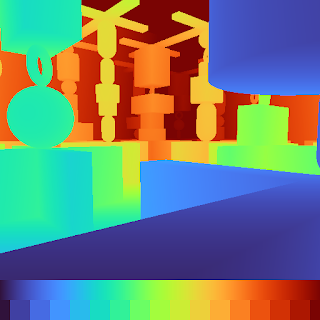
Uses the turbo colormap, which is distinguishable by all except those with
achromatopsia
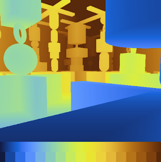
Incomplete red-green color vision deficiency; green hues appear more red

Unable to distinguish red and green
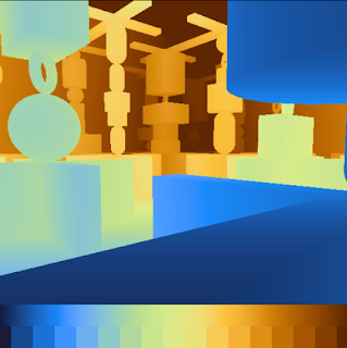
Incomplete red-green color vision deficiency; red hues appear more green
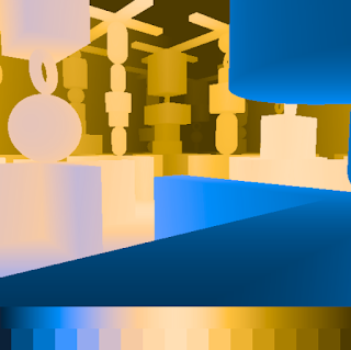
Unable to distinguish red and green
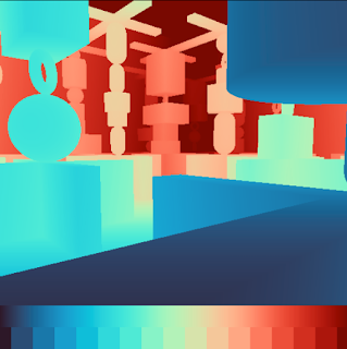
Reduced ability to distinguish blue-green, red-yellow
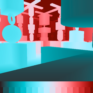
Unable to distinguish blue-green, purple-red, yellow-pink
Grayscale vision
Reference#
The following image shows the currently available built-in colormaps and their names: